About Project WE

Sources

Our research focuses on women’s participation in higher education, and how their educational pursuits can affect their careers and post-graduation lives in comparison to men. To carefully examine our research goal, we gathered a variety of credible articles, datasets, and analyses that revolve around gender gaps in higher educational attainment, such as the educational degree distribution data for race, gender, and location.

Although our data visualizations showed statistically significant disparities within educational attainment, we believe that such disparities are merely a symptom of a vast collection of multifaceted and deeply rooted issues that lie within The United States educational system and culture, and our analyses alone cannot fully encompass the weight and omnipotent impact of those systemic issues. Therefore, we attempted to supplement our depth by referencing sources that investigate tangential– yet crucial– socioeconomic factors that address a broader spectrum of reasons to deepen our understanding. For example, we noticed that although women currently attain more bachelor’s degrees, they still earn significantly less than men.

Among the several causes that pertain to this difference, we found the high early retirement and unemployment rates of women especially noteworthy. Gender norms place more expectations on women to retire early and take care of their children and breadwinner (a position that is typically assigned to men due to gender norms), instead of advancing further into their professional endeavors. In addition, we referenced data analyses that investigated the trends in which majors and careers attract women and men in higher education and beyond, and noticed jarring differences in the percentages of men and women who are pursuing degrees in computer science and engineering, which are the highest paying professions for bachelor’s degrees. 

Processing

The data that we chose was sourced from the United States Census website. In its raw form, the dataset had a Category column that included different metrics like Age by Educational Attainment, Race/Ethnicity by Educational Attainment, Median Earnings in 2021, etc with bifurcations amongst different Age groups, Races, and Educational Attainment Levels. The estimates were present for every state in the United States and the different types of estimates were total, Male, Female, Margin of Error, Male Margin of Error, Female Margin of Error, etc. We did not have the data in the form that could be used for analyses and creating visualizations and maps and hence some data cleaning and wrangling had to be done. 

Only the relevant total, male and female estimates were taken for each state and an independent dataset was created for each category namely, Median Earnings by Educational Attainment, Race by Educational Attainment, and Age by Educational Attainment. This was implemented in Google Sheets and RStudio. Once the uniform, separate datasets were cleaned after changing column names and restructuring some row and column names, the dataset was ready for data visualization and analysis. 

The datasets were in the form of different sheets in a Google Sheet and were exported to Tableau to create relevant visualizations in support of our research questions. 

Presentation

We built our website using Mobirise, a drag and drop website builder with the option to change the HTML and CSS, which allowed us to have more creative freedom in terms of designing the final project. The website was then published through GitHub Pages, a free code hosting service.

We began by looking through WordPress themes to get an idea of how we wanted our project website to look like. Our color scheme centers around a pinkish red that is feminine yet bold, reflecting our topic of women’s education and embracing femininity in a professional, independent direction. We also chose pink as our primary color to address the ‘pink is for girls’ stereotype. There are a myriad of traits that are also commonly associated with “pink” and “girly” that resemble unprofessionalism and naiveness, which we hoped to combat. However, we also attempted to decorate our website in a playful direction to make our analyses and visualizations feel welcoming. A large barrier that women face in higher education (and especially STEM) is closely tied to feelings of incompetence, which we desire to ameliorate. For instance, the act of embracing the color pink (which is already gendered as a “women’s” color) is followed by several negative connotations, such as frivolousness, immaturity, and, in some cases, stupidity. Although we do not support the idea of reinforcing the notion that pink is for girls and women, we believe that strong and intelligent women deserve to embrace this gendered color without facing any repercussions in the ways they are perceived. Using any other color as a means to support women’s preparedness and ability to excel in education could reinforce the notion that professional women must not embrace the color pink, which we strongly condemn.

The main goal we had in mind when we designed this website was establishing a welcoming atmosphere. To accomplish this goal, we opted for a clean, simple, and playful look, trying our best to avoid cluttering of texts and images. For our visualizations, we made sure to keep them straightforward and digestible. But because we know different people have different perspectives, it was important for us to also include captions and notes with specific details to mitigate any misunderstandings.  

Meet the Team

Mobirise Website Builder
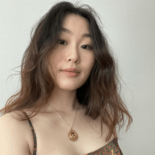
Irene Chung
Project Manager & Web Designer

Hi! My name is Irene and I am a third-year Psychology major who is minoring in Digital Humanities. As the Project Manager and Web Designer, I oversaw our project’s planning and implementation while facilitating clear and effective communication between our team, teaching assistant, and our professor. I also designed our website’s graphics and logos using Canva and created data visualizations using Tableau! Since project management entails everything from choosing the direction of our research to ensuring that our narrative remains ethical and conscious of our audience and surveyed demographics, I took extra steps to educate myself and my team of the potential implications of our research.
Mobirise Website Builder
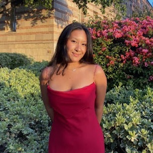
Jennifer Bough
Content Developer & Editor

Hi, my name is Jennifer and I am a third-year Sociology major with a Digital Humanities minor from New Jersey! As the content developer and editor, I oversaw the construction of our argument and the integration of our visualizations into our narrative, along with editing the entire project to ensure a smooth flow for the audience. I worked with the entire team to find academic sources to enhance our narrative, as well as create data visualizations that clearly show the evidence we have drawn from our dataset.
Mobirise Website Builder
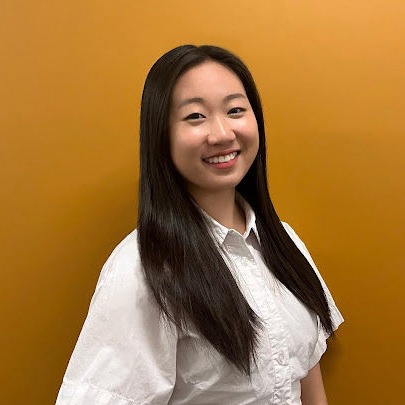
Jasmine Chu
Web Designer & Web Developer

Hi! My name is Jasmine and I am a second-year Statistics major looking to minor in Digital Humanities from San Francisco! As the Web designer and developer, I led the design and development process, utilizing Mobirise and a bit of HTML and CSS to build the website. Focusing on usability, I worked with the team to produce a simple yet compelling website for our project. I also helped with gathering sources for our narrative, creating the map on Tableau to support our claims, and finalizing the content on the website.

Mobirise Website Builder
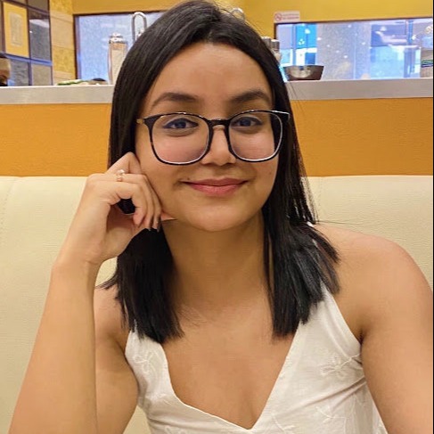
Anvesha Dutta
Data Specialist & Data Visualization Specialist

Hi! My name is Anvesha and I am a third-year majoring in Data Theory and minoring in Digital Humanities, from Abu Dhabi, UAE. As the Data Specialist and the Data Visualization Specialist, I undertook the cleaning, wrangling, compressing, and structuring of the massive, unclean dataset. Tools used were RStudio and Google Sheets to convert the raw data into a form that could be used to create visualizations, maps, and draw analyses from. I oversaw the creation of a timeline for the project using TimelineJS to map out important milestones in the journey and struggle of women in the workplace and education. I also created visualizations using Tableau, researched sources for the narrative, and helped in consolidating the numerical and data-centric scope of the project. I have explained the workings of the above mentioned tasks under the technical description of the Processing section.

Acknowledgements

Diana Blanco - for your help in finding and interpreting our dataset, as well as answering all of our questions along the way. Thank you so much for your overwhelming support throughout the entire process, we truly could not have done this without you!

Dr. Ashley Sanders - for teaching us the valuable skills and knowledge we utilized to formulate this project. Your love of Digital Humanities and care for your students easily made this one of the best courses we’ve taken at UCLA, we can’t thank you enough!

Annotated Bibliography

Any Questions?


Feel free to send us a message!